


November Updates from Syringe Access Services
The SAS team reports a big increase in the number of people who access services last month, and talks about the technology that has contributed to the effort.
We increased our outreach hours from 40 hours in September to 73.5 hours in October, which represents an 83.75% increase, or to put it simply, our outreach hours almost doubled!
Adding those extra hours significantly increased the number of folks in the community we were able to serve (536 in September vs 764 in October for a 42.5% increase). Outreach was also impacted by air quality in September, but arguably the addition of neighborhood maps and the more consistent approach to outreach we have adopted has also positively impacted our street outreach efforts.
Syringe Access Services (SAS) outreach teams have been using a much more organized system for collecting and tracking the rapidly changing landscape of people experiencing homelessness who live in tents or other structures in groups in San Francisco. Site reports are entered into a channel in Microsoft Teams after each shift. These reports include detailed information about every location the team went to, the size of the encampment, and other helpful information about each stop. This info is extracted from the Teams channel and entered into an Excel spreadsheet. We have some R Code, which was originally written by John Halifax’s partner, a marine ecologist, to track invasive European Green Crabs in the Puget Sound and other Pacific Northwest water bodies. John and his partner modified the Green Crab maps to generate a heatmap from the collated outreach data. We track camp and outreach locations and camps with Latinx residents.

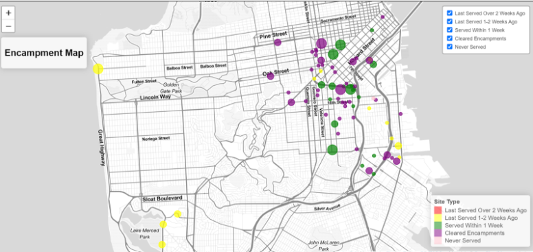
One challenge we encountered was the maps wouldn’t open on our iPhones because they were HTML file format.
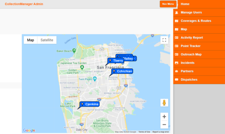
We worked with Diginido Labs to connect the map to our current website that is the Collection Manager Admin Portal for the Pick Up Crew syringe disposal app. Now there is an Outreach Maps selection in the navigation menu which allows staff access to the map in the field.
All the growth to our outreach services over the past few months have been key to expanding the number of people we serve and providing essential supplies to people who use drugs and experience homelesness.